Word of Life MN
Branding
Direction
Design
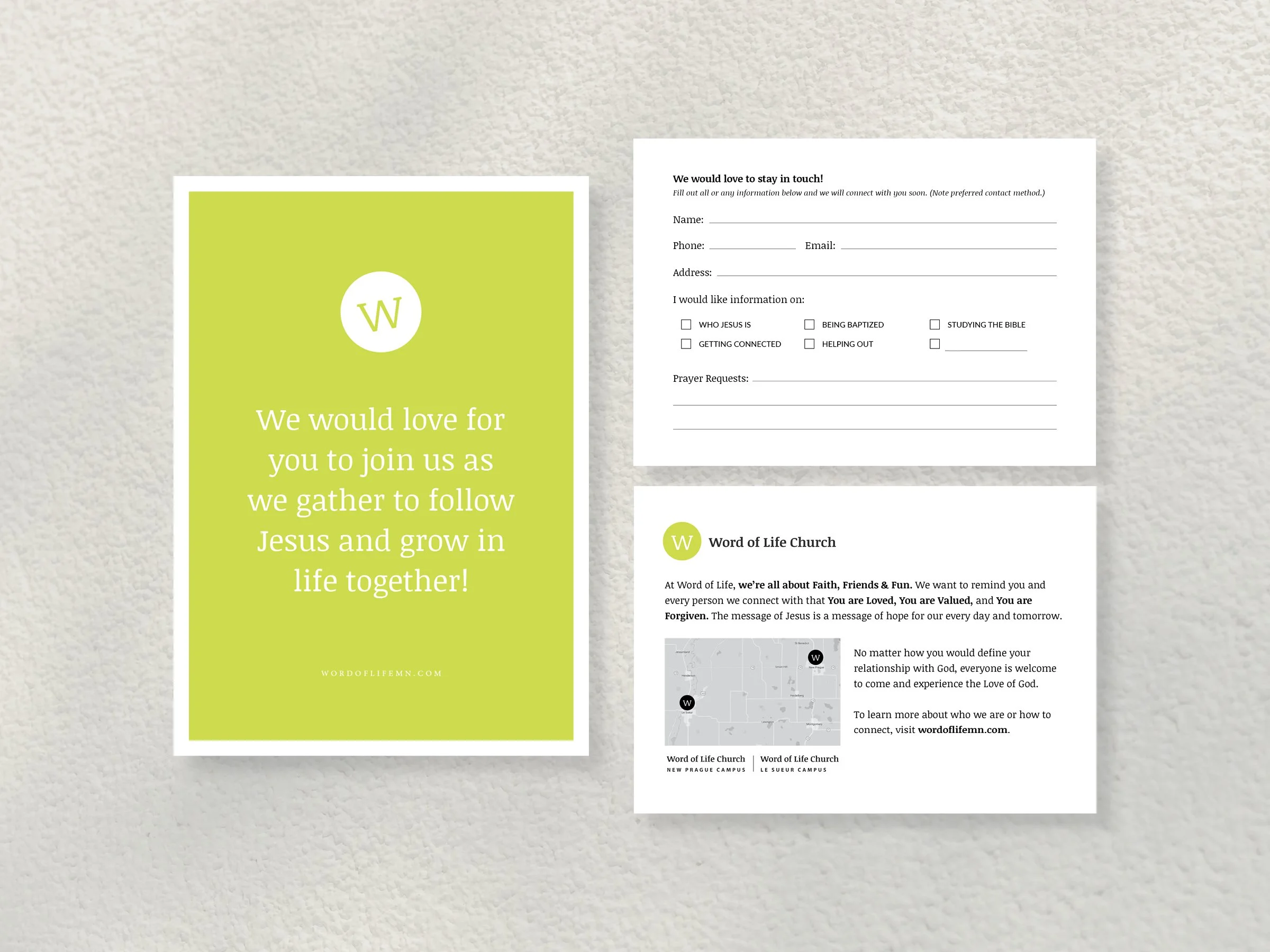
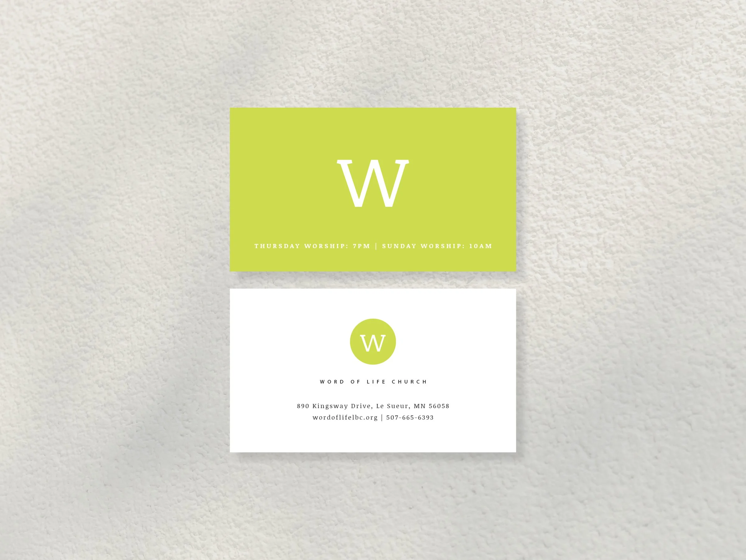
Word of Life is church in Southern Minnesota with a great heart for engaging with their communities and loving them well.
While the brand has grown and expanded as the ministry and needs expanded, it was built in stages over the course of a couple years. The initial brand approach involved using a bright, bold color and straightforward design approach as a way to create easy brand recognition in the community and bring a sense of energy, freshness, and joy. From there, student sub brands were created, expanding the color palette, while effortlessly integrating the primary brand colors.
Projects have included banners, connect cards, event designs, info cards, invitations, letterhead, nametags, postcards, sandwich boards, screens, sermon series, stage design, stickers, student brands, web banners, and so much more.